If you’ve spent five minutes looking at senior living advertisements, you’ve noticed there’s a familiar formula: clean visuals, smiling residents, a professional grade lobby, and a clear promise – you’ll be happy here. It’s safe, professional, and it works…to a point. Of course, there’s nothing inherently wrong with it. We all want to know Mom or Dad will be happy and the facilities are clean, but after a while everything starts to blend into one big blur of “care”. When everyone is speaking the same language, the message gets so quiet it becomes invisible. That’s the problem we set out to solve with our client. How do you stand out in an industry that feels almost allergic to risk?
The answer wasn’t louder messaging or flashier production. It was a shift in perspective from features to feelings. Rather than focusing on what the community offers, we started thinking about who we were speaking to on a deeper level. Not just “seniors” as demographic, but as individuals with decades of lived experience, cultural touchstones, and emotional memory. We decided to burn the playbook. We moved away from the corporate “professionalism” and shifted toward something far more powerful, nostalgia.
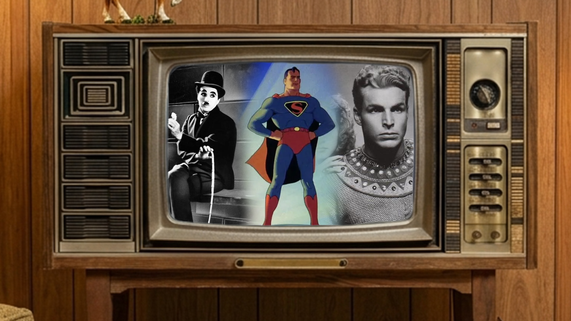
Utilizing nostalgia in a way that felt intentional, we started leaning into and building campaigns leveraging the iconic media that defined their youth using familiar references and visual cues to make the campaigns feel engaging without abandoning clarity or information. For instance, instead of another brochure style ad about cost, we rolled out creative featuring old western films, Charlie Chaplin, Flash Gordon, and the iconic Max Fleischer Superman. We even turned what would have been generic ads meant to drive to insightful infographics on their website, into riffs on The Beatles and the beloved 1960-70s dating show The Dating Game which was sure to peak the audience’s interest. Whether it was drawing inspiration from classic film, early television, or influential music, the goal wasn’t just recognition, it was connection. By referencing the culture they grew up with, we were showing them that we know who they are.
The shift was immediate. By Stepping out of the “cut and dry” norm, we saw a massive spike in engagement compared to the traditional creative we had run previously. More importantly, the work started conversations, not just impressions. It turns out when you step out the industry norms and treat seniors like individuals with a rich history rather than just “prospects”, you give them a reason to actually pay attention. You can tell someone your community is great, or you can make them feel a flash of the same excitement they felt watching a Saturday morning serial 70 years ago. One is a sales pitch. The other, a conversation.
There’s a tendency in industries like senior living to play it safe, and that instinct isn’t coming from nowhere. You’re dealing with big decisions, real emotions, and people’s lives. What tends to get lost is the idea that reframing your creative means you need to be edgy for the sake of it. It’s about recognizing that “professional” creative doesn’t have to be boring creative. You can still convey high-quality care and safety while using a tone that has soul. In an industry that often feels clinical, being the brand that brings a bit of technicolor personality to the table is not only a creative choice but a competitive advantage.
The lesson here is simple. Don’t be afraid to break the mold. If your marketing looks exactly like the guy down the street, you’re just another part of the background noise. Recognize that at the end of the day, people don’t connect with square footage, dining options, or activity calendars (not at first, anyway). If you can tap into a feeling, a memory, a laugh, or a classic hero, you stop being a commodity and start being a brand people actually remember. If you can speak their language and remind them of who they are (not just where they might live), the rest becomes a lot easier to sell.